What Building PipeFlow Taught Me About SaaS Dashboards
23/08/2026
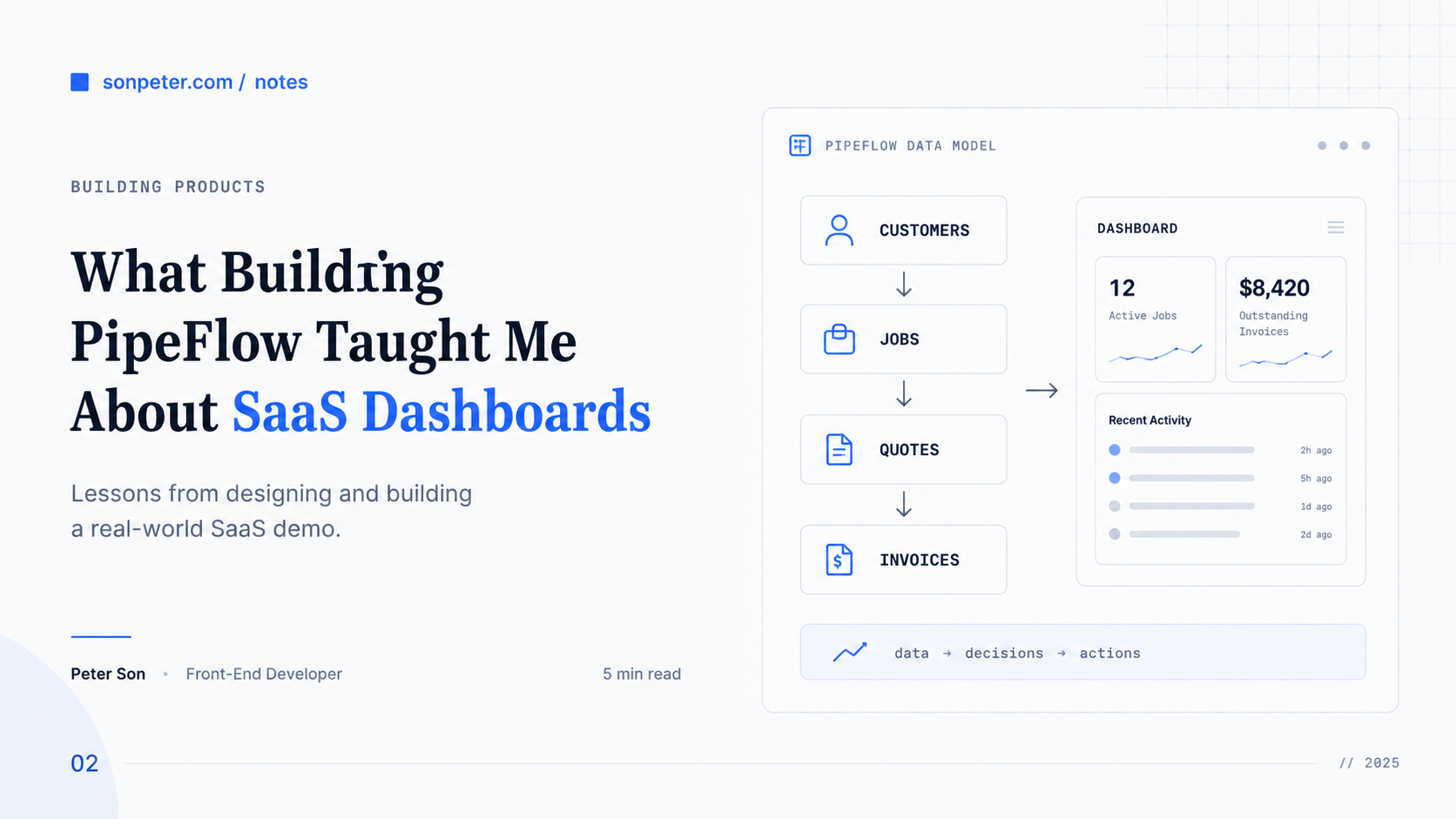
When I started building PipeFlow, I thought the dashboard would be one of the simpler parts of the project.
Add a few summary cards, show some recent activity, make it responsive, and move on.
In practice, building a useful SaaS dashboard made me think much more carefully about product decisions, data modelling, and application architecture.
PipeFlow is a SaaS demo for a small plumbing business. It manages customers, jobs, quotes, and invoices using Next.js, TypeScript, Supabase, and PostgreSQL.
Here are a few things I learned while building it.
1. A Dashboard Should Answer Questions
It is easy to fill a dashboard with numbers simply because the data is available.
But a useful dashboard should help the user quickly understand what is happening.
Instead of asking:
What metrics can I display?
I started thinking more about:
What does the user need to know when they open the app?
For a service business, that might mean:
- How many jobs are currently active?
- Which quotes are still waiting for approval?
- How much money is outstanding?
- Are there invoices that need attention?
That changed how I thought about dashboard design.
The goal is not to show as much information as possible. It is to surface the information that helps someone decide what to do next.
2. The Data Model Shapes the UI
PipeFlow has a fairly simple business model:
Customer
   ↓
 Job
   ↓
Quote
   ↓
Invoice
But even this small set of relationships affects almost every part of the application.
A quote belongs to a customer and is usually connected to a job. An invoice may be created from an accepted quote. Dashboard totals depend on the status of those records.
That made me appreciate something I did not think about as much when working mostly on the frontend:
A clean UI often depends on a clean data model.
If relationships between data are unclear, the UI becomes harder to build and business logic starts spreading across components.
Thinking about the database and the interface together made the application much easier to reason about.
3. Empty States Matter More Than You Think
A dashboard full of demo data usually looks good.
A dashboard with no data is a much harder design problem.
What should a new user see when they have:
- no customers
- no jobs
- no quotes
- no invoices
A blank table is technically correct, but it does not help someone understand what to do next.
I started treating empty states as part of the product rather than something to add at the end.
A good empty state can explain what a feature does and provide a clear next action.
The same applies to loading states and errors.
They may not appear in portfolio screenshots, but they are a big part of what makes an application feel complete.
4. Reuse Patterns, Not Everything
Customers, jobs, quotes, and invoices all share similar interface patterns.
They have lists, forms, detail views, statuses, and actions.
It is tempting to build one extremely generic system that handles all of them.
I tried to resist that.
Instead, I built the individual features first and extracted shared components when the repetition became obvious.
That usually resulted in simpler abstractions.
I have learned that making something reusable too early can sometimes make the code harder to understand than a little duplication would have.
For me, the better rule is:
Build the simple version first. Generalise when you have evidence that the pattern is actually shared.
5. A Portfolio Project Still Benefits From Production Thinking
PipeFlow is a demo application, but I did not want it to behave like a disposable prototype.
That meant thinking about things such as:
- authentication
- database permissions
- validation
- destructive actions
- error handling
- testing
- deployment
For example, using Supabase meant I had to think about Row Level Security rather than assuming that hiding something in the interface was enough to protect the data.
Working through these areas made the project much more useful as a learning exercise.
The interesting part of building a SaaS app is not only making the screens work. It is understanding what happens between the interface, the server, and the database.
Final Thoughts
PipeFlow started as a portfolio project, but it has become a useful place for me to practise building applications beyond the UI layer.
The biggest lesson from building the dashboard was that a good SaaS interface is not just a collection of components.
It sits on top of product decisions, business rules, and data relationships.
The better I understand those layers, the easier it becomes to build interfaces that are useful rather than simply polished.
And that is probably the part of building PipeFlow that I have found most valuable.